Ayamas (http://www.ayamas.com.my/)
1) The design suits with the branding.2) Nice color scheme.
3) Wise use of space to avoid overloading informations on 1 page.
4) Interesting photo montages are used with a little animation going on.
5) User friendly as the navigation buttons are simple and obvious.
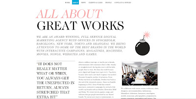
Greatworks (http://www.greatworks.se/)
1) The hierarchy is played well within a grid system.2) Designs are very minimum.
3) Instead of using squarish boxes for the picture borders, circles are used with a little touch of an icon.
4) Since little visuals are used, the typography plays a big role.
5) Navigation buttons are very simple but it suits the overall mood of the website.
LEGO (http://www.lego.com/en-us/Default.aspx)
1) The little animation makes the overall look more lively and fun, kids would love it.2) Design visuals look fun and exciting.
3) In some pages the navigation button designs change to fit the mood of other games.
4) Bright colours are used, suitable for LEGO.
UNIQLO (http://www.uniqlo.com/my/corp/)
1) It looks neat and sleek.2) Pictures play an important role here since it's the key point to sell their products.
3) Even though the logo is in red, the website doesn't really use that much of red for the layout design, the designer made it look "classy" by putting a bright colour against black and white, it speaks out the brand.
4) Jquery is pretty much used as the pictures will change, it makes the website look less static.
5) Lots of buttons are hidden within the navigation bar, only when you mouse over it, you'd see other buttons. A good way to keep the outlook neat and easy to the eyes.


No comments:
Post a Comment